After a Decade, We Debut Carpe Vino’s New Logo
![]() Ten years is long enough, at least that is the conclusion Drew and I came to after the ground-up overhaul our web site was completed recently. We decided it was time to retire our original Carpe Vino logo and replace it with something more appropriate for the next decade.
Ten years is long enough, at least that is the conclusion Drew and I came to after the ground-up overhaul our web site was completed recently. We decided it was time to retire our original Carpe Vino logo and replace it with something more appropriate for the next decade.
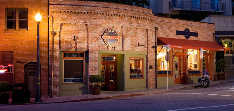
The reason is simple. When we launched Carpe Vino in 2002, we were positioned as a local wine shop and a purveyor of wine produced in the Sierra foothills. Our original logo served us well, but we wanted to create something bolder that was more representative of our service to a national marketplace made possible because early on we recognized and embraced the power and reach of the Internet.
What sparked our thinking was the design for our five-year pins that were created by Linda Pearce, co-owner of our neighbor in Old Town, Sierra Moon. She created a stylized “CV” as the focal point of the pin design that was also used in cuff links I ordered for Drew and me to commemorate our 10 years of working together.
We sat down with our long-time designer, Michele Tuggle of Auburn, and came up with some ideas that she executed beautifully on paper. The result is a much bolder presentation with a more contemporary look. We dropped “Old Town Auburn” used with our original logo with the intent of positioning Carpe Vino as much more than a local wine shop, but as a national purveyor of wine and as a destination for fine dining in northern California.
The wax seal evokes the classic wax dipped bottles often associated with premium wines. The “Carpe Vino” logotype is bolder, strong and, frankly, more masculine. . .the result of two dudes running the joint.
We hope our customers appreciate this change. It’s just another component of growing the business!